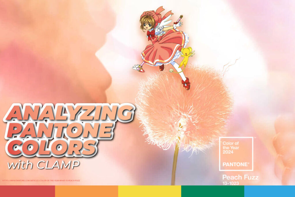

Greetings, color enthusiasts! Last year, PANTONE surprised us with the announcement of the official color for 2024: Peach Fuzz (13-1023). Do you remember that iconic outfit our beloved Sakura Kinomoto wore in the 1st opening of the series, the first of the saga, and most importantly, the one featured on the manga cover? That’s right! It’s very similar to this year’s PANTONE color. I bet you can already guess where this article is heading.
Pantone Peach Fuzz: Anime Examples
This color has been used in various anime (hair, clothing, landscapes, among others) over the years to convey a sense of kindness, innocence, and sweetness. If you look closely, any character sporting this color, whether in clothing or hair, tends to be the sweetest in the series or could potentially become the heroine. Did you notice that?
The experts in using this type of color are the creators known as CLAMP. They are an all-female Japanese manga artist group consisting of the leader and writer Nanase Ohkawa (born in Osaka) and three artists whose roles change in each series: Mokona, Tsubaki Nekoi, and Satsuki Igarashi (all born in Kyoto).
Chobits, Tsubasa: Reservoir Chronicle, Cardcaptor Sakura: Clear Card, and Sakura Cardcaptor are a few of their works where you can see the best examples of this color being used for the sweetest anime characters.
Sakura often wears this color in the outfits designed for her by Tomoyo. You can see it in the one from the beginning, as I mentioned earlier, and in more than 8 outfits throughout the series.
Although it may seem that pink and this new PANTONE color are very similar, especially in meaning, the reality is quite different. Pink is a color that you can describe as a lightened red, fuchsia, or magenta, in other words, red lightened with white. In color psychology, pink is a bright and cheerful color. It is a feminine color, especially in early childhood, and reminds us of qualities traditionally considered feminine, such as softness and kindness.
In contrast, Peach Fuzz is more of a peachy tone that conveys a sense of goodness and tenderness, communicating a message of attention, sharing, community, and collaboration. “It’s a warm and inviting shade that highlights our desire to be together”. (PANTONE)
How to use in Graphic Design
In graphic design, Peach Fuzz can add a touch of sweetness and kindness to any branding project. Soft colors can also be a grreat tool to create product designs, such as clothing, accessories, and other items, especially when aiming to convey a sense of friendliness and protection.
Incorporating Peach Fuzz into web design creates a friendly and welcoming atmosphere. This soft and warm tone it’s perfect to use in key elements of the user interface, such as buttons, backgrounds, and calls to action, creating a visual experience that invites users to explore comfortably and confidently.
In social media or print design, you can implement it strategically in keywords, elements you want to highlight, and more to achieve better results in your designs.
PANTONE Peach Fuzz 13-1023 is a soft and warm color that conveys sweetness and strength. This color it’s popular to create cozy and stylish environments, branding, or social media posts to convey innocence and friendship, and to inspire heartwarming product designs. In 2024, we hope to see more of this shade on our screens and in our daily lives!
Just like Tomoyo creating Sakura’s outfits, don’t hesitate to take risks. Use Peach Fuzz in your upcoming projects!
If you have any further questions about graphic design, visit our blog.