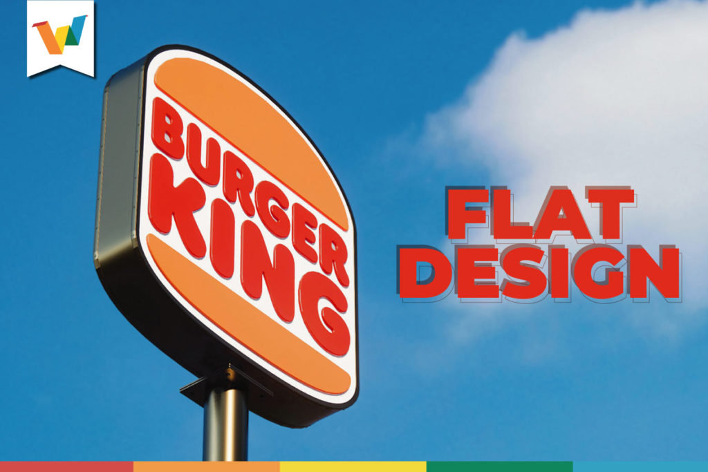
The rise of Flat design seems to continue to grow. Although this trend was present for a while, today we see how the big brands bet on the simple and functional.
It all seems to have started with the announcement of the redesign of the fast-food chain ‘Burger King’, which did not change its logo for 20 years. But for a long time, we have seen that brands such as Apple, Master Card, Instagram, Netflix, and others have adopted the trend that goes from designs with textures and dimensions to a much cleaner design, where functionality is the main protagonist.
Why the Flat Design?
As the world changes, trends and strategies are not far behind, the simplicity of a flat design allows the brand to have a cleaner face. Also, an adaptable logo is easier to use on different digital platforms.
However, it is about the need to adapt to changes over time. This is a demonstration that everything changes and that a brand that is agile and adaptable to changes secures its path as time passes.
Without changing the meaning …
As we mentioned before, Burger King is one of those that has been talking about in recent days.
Undoubtedly, the fast food chain, with the redesign that it has carried out, has not lost its identity, it has not set aside tradition and its change is closely related to the values of the brand and what it has transmitted over time.
Without a doubt, the ‘Flat Design’ will be one of those that will be seen for a while longer. More and more are the brands that bet on the simple and above all the functional.


