

At the beginning of the internet, there were only desktop computers and the era of laptops began, because between the similarity of the screens of these computers and the technology existing at that time, the design of a website was quite basic, simple, it was limited to the text and very few images or illustrations.
Over the years, technological evolution, development of new web languages and the raise of new types of devices such as smartphones and tablets, generating new dimensions of screens and the possibility of being connected anywhere and at anytime, creates the necessity to display Websites suitably for each of the existing devices.
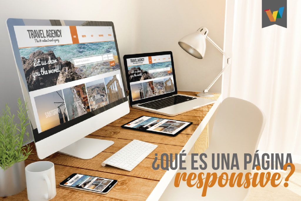
As a result of this, the tools were created and the Responsive Web Design standards were defined, which is nothing more than the technique that seeks the correct display of the same web page through any type of device (mobile, tablet, laptop or desktop), allowing content to be reorganized automatically according to the size of the device screen through which it is consumed.
This technique is based on giving priority to the information that will be displayed on mobile devices, since they are the main source of connection to information by users, and from this point, information, improvements and even other functionalities will be added as the screens get bigger.
What does this imply? It involves not only the redistribution of the elements, but also the use of different sizes for the texts, spaces, icons, the optimization of the images, among others.
5 great advantages of using responsive design
- Super Flexible: Sites with this type of web design are fluid, meaning content moves freely across all screen resolutions and all devices.
- Excellent user experience: While content is king, the metric of success is user experience, which allows visitors to consume content through the device of their choice and preference, at any time. Therefore, responsive web design is all about delivering the optimal user experience regardless of whether you are using a desktop computer, smartphone, tablet or Smart TV.
- Cost-effective: The advantages of having a single site that meets the needs of all devices are significant when compared to having two separate websites. A website costs less than two, obviously, and the savings can be substantial.
- It is recommended by Google: They claim that responsive web design in its mobile configuration is recommended, and even goes so far as to refer to responsive web design as the industry of best practices.
- Very easy to manage: Having an independent desktop website from a mobile one requires having separate SEO campaigns. Managing one site and one SEO campaign is much easier than managing two sites and two SEO campaigns.
A web page is the heart in the digital ecosystem of any brand, person or company, it is where most of the components to include in a digital marketing strategy, will seek to land the actions to capture intentions and generate results.
Do you have a suitable responsive website to develop your VidaDigital?