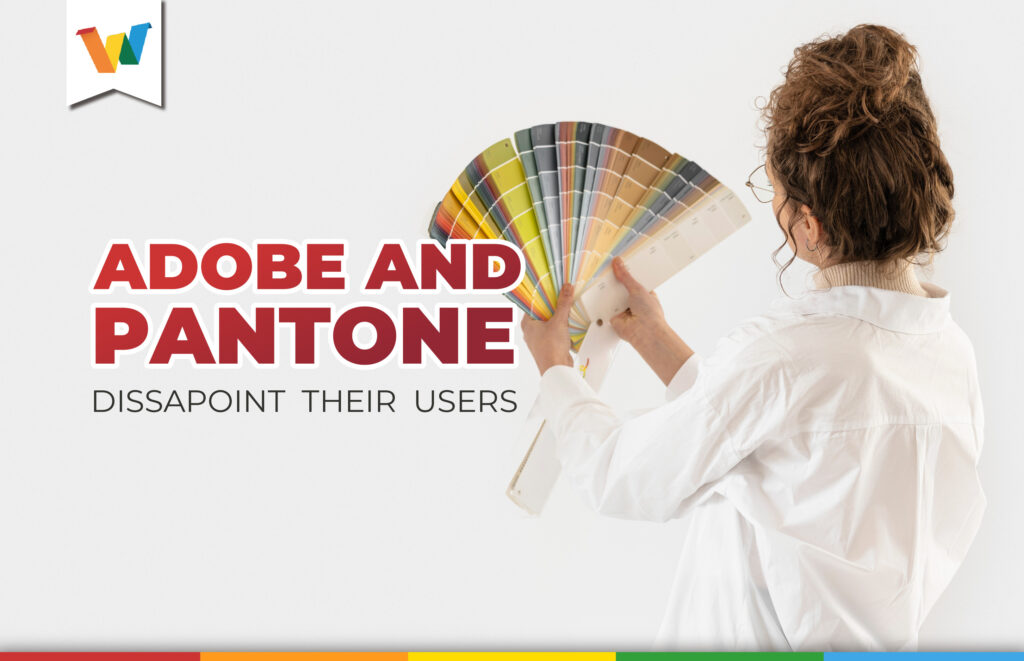

There are about seven colors in the spectrum, so why do we say there are hundreds, if not thousands of them? It’s because of the immense amount of variations in shade and saturation that each one has, and we have curious ways of referring to them. Christmas red, chicken yellow, sky blue, leaf green… They seem like accurate and easily recognizable names, and usually are in everyday conversations. Speaking in this way is perfectly valid in day-to-day life, but in the professional environment, this can be a serious problem.
Two people may have slight disagreements in their conception of exactly what the color turquoise is, and this can lead to a misunderstanding that can result in thousands of copies of a publication being produced or printed in the wrong color. That is why Lawrence Herbert, in 1963 created the famous Pantone guide.
Originally with only ten colors, Herbert specified the exact ink formula for each shade. By assigning each of the shades a code, communication between creatives, printers and manufacturers became standardized thereafter.
Over the years, Pantone has expanded its guide (more than 2,300 patented colors to date) and has become a standard for the printing world. Thanks to this standard, one can speak of turquoise with the assurance that everyone is talking about the same color, Pantone 1837 C.
Pantone has become a synonym for color, and as such has been implemented as an essential tool in graphic software. Adobe, as the king of these programs, made these Pantone color books available to designers for years for their creations.
But, ironically, the image of one of these guides is the protagonist of the startup screen for Adobe InDesign in its new version 2023. Why?
Months ago, an update of the ads for the new version on Adobe’s official website warned of changes that users would not like but that went unnoticed, until shortly after the launch of the new software, Twitter user Iain Anderson sounded all the alarms.
Fun times ahead for #Adobe designers. Today, if you open a PSD (even one that’s 20 years old) with an obscure PANTONE colour, it will remove the colour and make it black. Pantone want US$21/month for access, and Solid Coated goes behind the paywall in early November. pic.twitter.com/BUxzViYFaQ
— Iain Anderson (@funwithstuff) October 28, 2022
What was going on, what did Adobe notice that few people read carefully?
“In the coming months, Pantone color libraries may no longer be available through software updates for some of our applications.”
For printers and industry experts, the decision will undoubtedly alter workflows and quality control habits. And some consumers, feeling ripped off, are balking at the prospect of paying a new subscription fee on top of recurring charges to license Adobe software.
In addition to the usual Adobe Creative Cloud subscription plans, Pantone Connect will cost $7.99 per month or $35.99 for a full year the first year and $59.99 per year thereafter.
The remaining color books are gone from Illustrator and now appear as subfolders in “Legacy Swatches,” a new folder in Photoshop’s swatch libraries. There, it is possible to view the swatches but not use them.
What consequences are scaring users?
Thanks to the warning shared by Iain Anderson, when a legacy Photoshop file is opened with a monotone, duotone, tritone, or other types of spot color channel defined by Pantone colors, those colors will not appear in their original hues, but as Photoshop’s default black. (#000000 hexadecimal, or 75C/68M/67Y/90K), complicating in many cases the files and the work of designers and the latter have shown their discontent in the quotes in his tweet.
“Pay subscription for colors” is something that did not occur to any author of dystopias. https://t.co/mC7aJar7ES
— Andrés Diplotti 🐀 (@adiplotti)
Today, on things you didn’t think could be rented:
The colors https://t.co/nC3Aq0KMZe
— David Maeztu (@davidmaeztu)
Putting colors behind a paywall is literally insane https://t.co/SYAkU73BoL
— Shell 🐚✨ (@Shellanin)
But among so many complaints and grievances, a hero has emerged. The artist Stuart Semple, who created FREETONE, a library that contains (to date) 1280 colors that designers can use for free, thus combating the unfair changes considered by Pantone and Adobe.
Adobe & Pantone think they can own colours and charge us to use them! So I’ve just liberated the whole colour book and I’m giving it away for FREE unless you’re associated with Adobe or Pantone! You can get yours for free here: https://t.co/deQ2RUub8e pic.twitter.com/VDO3bQeuQ1
— STUART SEMPLE (@stuartsemple) October 28, 2022
To download and use this new color guide you only need to meet a few simple and seemingly fair conditions.
- Confirm that you are not an Adobe or Pantone employee.
- Not be associated with Adobe or Pantone.
- Not let it fall into the hands of anyone at Adobe and Pantone.